|
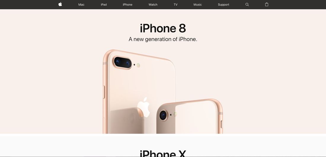
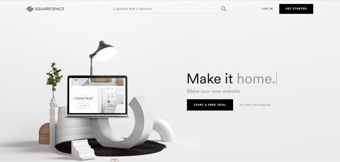
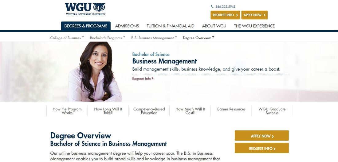
When it comes to building a business website, presentation is key. A business can be the best in its market, with a genius idea ahead of its time. It can have the most prime location in the city and the friendliest customer service providers in the industry. Yet, these vital elements cannot unlock the business’s full potential without a culturally relevant and informative website layout. Apple In a media-centered world, audiences are unabashedly attracted to images. Before reading content--before even reading the name in some cases--consumers doing a general online search will click a link and spent 3 seconds assessing a website based on its layout. Therefore, having a recognizable logo is only the first step in attaining visual credibility. Apple employs a simple — but effective — marketing strategy by placing a practically luminescent picture of their latest iPhone model right in the center of the screen. Its bright colors and trademark design capture the attention and the consumer is likely to spend another 5 to 10 seconds scrolling through the rest of the homepage. If they like what they see, their inclination to learn more deepens. Squarespace Once attention is acquired, the next step lies in making the homepage just informative enough that the consumer will click through to the links at the top. These are not click-bait, but rather enticing little blurbs — like the summary on the back of a book — that leave the reader wanting more. Squarespace’s website does this beautifully, planting short, snappy snippets about their product next to high-quality images. They further grab viewers’ attention with a video presentation of these snippets, making it appear as though the words are being typed to communicate with potential customers on an individual basis. They also use no more than three sentences per blurb, quickly grabbing viewers’ attention and directing it right where they want it. Western Governors University As a big name in the online education industry, Western Governors University excels at helping potential students find all the information they need within a glance and a few clicks. With a clean, high-contrast layout, nothing distracts from the information that students are looking for. On their Business Management Bachelor Degree page, for example, a picture of a smiling woman next to the program name immediately creates a positive association for the reader and makes them think, “That happy person could be me.”
All necessary information is easy to find through the judicious use of menus and submenus at the top of the page. The content below generously applies headers, subheaders, bullet points, and “learn more” links to make it easily scannable for readers. Additional content is also clearly marked with colored sections at the reader scrolls, refocusing their attention and maintaining page engagement. Few things are as frustrating as a company who that hides their contact information (and it makes them look like they have something to hide). Also avoid using cute names for your “About”, “Contact”, “History”, and so forth. The links at the top should be professional and direct so consumers may find exactly what they are looking for in 5 seconds or less. *** Using other successful sites as models will greatly increase the likelihood of success with your own business website. If you are redesigning, you are likely to see an increase in hits as well as increased revenue, enabling you to expand further.
0 Comments
Your comment will be posted after it is approved.
Leave a Reply. |
Archives
June 2024
Categories
All
|
Website Design Gettysburg | Services | Website Designer Near Me | Prices | Contact Gettysburg Website Design | Design Blog
From Our Blog
3 Steps to Improve Your Google Business Listing Ranking • Search Engine Optimization + GMB = More Leads & Sales! • Website SEO Checklist
Secrets To Building an Appealing Website For Any Niche
Secrets To Building an Appealing Website For Any Niche
|
Crawford Designs, LLC
Gettysburg Website Design |
© 2021 Gettysburg Website Design.
717-855-3184 |
SERVICES: Website Design, Local Gettysburg Website Design Services, Website Design Company, Website Development Company, Freelance Web Designer, Web Design Company, Web Development Company, Business Websites, Corporate Websites, Business Marketing and Advertising. Website Maker, Web Site Creator, Web Builder, Done For You Websites, Hire a Website Designer, How to Get a Business Website, best website design companies for small business, website design pa, website for small business owners, web design and marketing company, top website design company, york county web design, local web design companies near me, small business web design near me, web design westminster md, web designers in hanover pa, small design companies


 RSS Feed

